


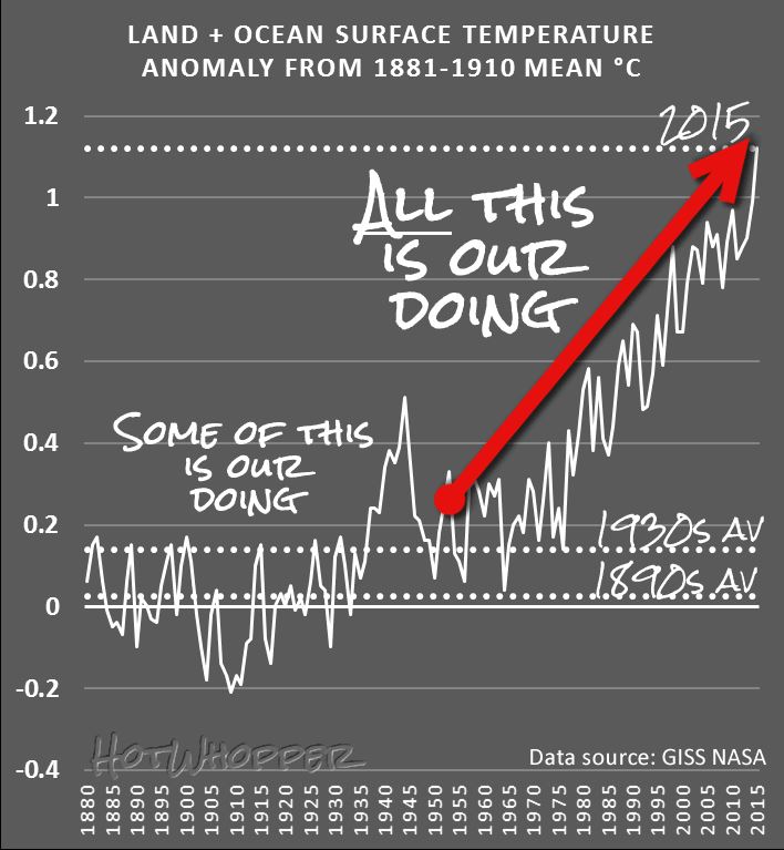
Chart from HotWhopper.com
You’d think that this was a simple question to answer, and it is really, but there are people who dispute this fact – despite the mountains of evidence we have. In this article, I’m not going to address why the Earth is warming, but just establish the fact that it is, and also that it is doing so at an unusually fast rate.
Firstly, let’s set the time-frame that is concerning us here. We know that the climate of the Earth has changed in the past, well before we humans were capable of influencing it. Indeed, the scientific study of palaeoclimatology has revealed that climate changes that have occurred in the past have helped us understand that the ‘recent’ warming is unusual. So, what does ‘recent’ mean? In this article ‘recent’ means since about 1850.
Now that I can use the word ‘recent’ so that we all know what it means, to be able to state that the level of warming that we measure is ‘unusual’ I need to define what ‘unusual’ means. I can hear the groans of dismay from here! However, bear with me because so much is made about how the recent changes can be dismissed as simply ‘natural’, I have to set a baseline of what is natural so that we can agree that the recent warming is ‘unusual’.
Past Global Temperatures
Because we have only been using instruments to physically measure the temperature around the world for a hundred years or so, we need to use other ‘proxy’ methods. These include ice cores, tree rings, coral reefs and lake and ocean sediments amongst others. The data extracted using these proxies can be used to reconstruct various aspects of the climate, including global temperatures before instrumental records became available.
The chart in Figure 1 below is a recent version of one of the most talked about graphs in the history of science. It has been called the ‘Hockey Stick’ because the recent rapid upturn in global temperature looks like the upturned blade of a hockey stick.
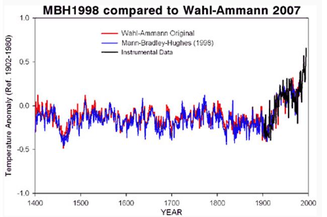
Figure 1: The 1998 original Hockey Stick chart (blue), shown against a 2007 reconstruction by Wahl & Amman (red). More recent data from instruments are in black.
Michael Mann’s original 1998 version has been the subject of intense scrutiny over the years, and the denier community has done a very good job in attacking it to the point where many people think that the hockey stick is ‘broken’. However this could not be further from the truth. Several more recent reconstructions carried out independently using a variety of techniques and proxies have all verified the original findings. The denier community do this all the time – they just keep repeating a particular message again and again until it becomes fixed in the minds of the press and the public, even though it is not true. However, the scientific method keeps grinding on, and the climate scientists have concluded that the main ‘take-away’ is as follows:
The last few decades are the hottest in the last 500 to 2000 years (depending on how far back the reconstruction goes).
This answers the definition of what we mean by ‘unusual’ warming.
By the way, get used to looking at ‘anomalies’ when viewing data and charts. Just about every chart or table we look at in the field of climate science show anomalies of something, be it temperature or amount of ice loss. The anomaly values are always the difference compared to a baseline figure which will be plotted as the zero. The baseline will be a calculated average over a number of years. For example in the hockey stick chart shown above, the left axis describes the baseline as ‘Ref. 1902-1980’, and this averaged figure will appear at 0.0 on the axis. Temperatures warmer than the baseline appear above the 0.0 baseline, and cooler below.
Multiple Lines of Evidence
There are many lines of evidence that we can look at to find out if the recent warming is unusual (notice how I can use those two words now and we all know what I mean).
Direct measurements
We have global records of land and sea surface air temperatures as well as air temperatures over the oceans. Some of these temperature records go back to about 1850. You will hear a lot of nonsense from the denier community who regularly bleat on about badly placed measuring stations and urban heat island effects; but none of that detracts from the fact that all these calibrated measurements show the recent warming very clearly. I might write a separate article about the badly-placed weather stations and why it is that we know they don’t make a jot of difference.
There are several datasets of global air temperatures, and a good example is the data from the Goddard Institute of Space Studies (GISS). The data in their GISSTEMP analysis comes from weather measurement stations, and you can download the raw data yourself. The chart below comes from the GISSTEMP data analyses:
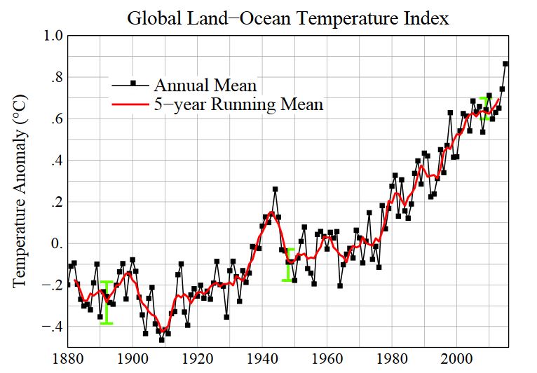
Figure 2: Line plot of global mean land-ocean temperature index, 1880 to present, with the base period 1951-1980. The dotted black line is the annual mean and the solid red line is the five-year mean. The green bars show uncertainty estimates.
Satellite Measurements
I could put this under the ‘Direct Measurements’ section above, because satellites orbiting the Earth are equipped with sophisticated instruments that are making direct measurements of something; but they cannot directly measure temperature with a thermometer in the same way as a weather station does, or a ship which measures the temperature of the water at the surface of the ocean (often done by hauling in a bucket of water!). Satellite measurements can lead to an indirect measurement of the air temperature at various altitudes in the troposphere, but there are a lot of manipulations of the raw measurements required to do this. This is what a scientist who works with the Remote Sensing Systems (RSS) satellite dataset said recently:
They [satellites] are not thermometers in space. The satellite [temperature] data … were obtained from so-called Microwave Sounding Units (MSUs), which measure the microwave emissions of oxygen molecules from broad atmospheric layers. Converting this information to estimates of temperature trends has substantial uncertainties.
However, climate change deniers, like Senator Ted Cruz (R-Tx) have been holding up the RSS satellite dataset as “the best data we haveâ€. They like to say this because the RSS data has, until recently, shown the least amount of warming in recent years. They like to say that the satellite data is more reliable than the ground based measurements which we discussed in the ‘Direct Measurements’ section above. However, there have been recent adjustments made to the RSS data which the deniers don’t like. Have a look at this video:
[youtube]https://www.youtube.com/watch?v=UVMsYXzmUYk[/youtube]
So, in summary, satellite measurements are valuable if correctly converted and calibrated, and they also show a warming, as shown in the chart below which is the latest RSS data which has been properly adjusted for diurnal variation (as described in the above video clip, and more information here).
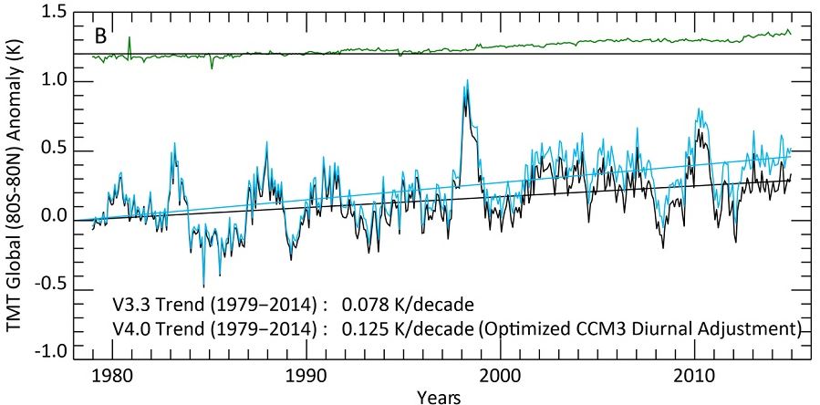
Figure 3 – The global Middle Troposphere (TMT) anomalies from 1980 to now. The black line shows the old version, the light blue line the new. Note that the overall trend in the new version is 60% bigger than in the old version. The green line at the top shows the effect of the improved diurnal correction.
Just before we leave this section, it is interesting to note a denier trick to do with cherry picking the data. Take another look at the RSS data chart above, and notice the big peak around 1998 – that was due to a very big El Nino year. What people like Ted Cruz like to do is show a small section of this data where the left-hand side of the chart starts at that 1998 peak. They then draw a line through the data which appears to show cooling because the trend appears to go down, not up. This is also known as deliberately lying and abusing one’s position of authority – something that Ted Cruz seems to do on a regular basis.
Rise in Sea Level
There are two reasons why a rise in sea levels provides an indication that the world is warming. The first reason is due to the fact that water expands as it warms, and the second is the addition of extra water from melting ice caps and glaciers. But before going into any details we must again establish a baseline so that we can show that the recent rise in sea levels is ‘unusual’.
The basic summary of past sea levels goes like this: At the end of the last ice age (about 21,000 years ago), global sea levels rose 120 metres over several millennia and stabilised between 2,000 and 3,000 years ago. There is strong evidence to show that sea levels have changed very little from around AD 0 to about AD 1900. Since then there has been a marked, measured increase in global sea levels. So, the story for sea levels is very similar to the hockey stick described above for global temperatures, and it is clear to see that the recent measured rise is certainly ‘unusual’. This really is not surprising because the curve just has to follow the shape of the temperature anomaly curve because basic physics says that it should!
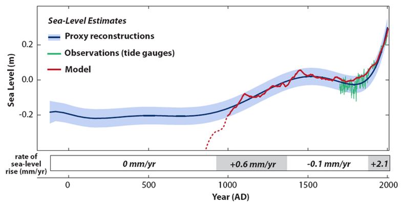 Figure 4 – Sea level evolution in North Carolina from proxy data (blue curve with uncertainty range). Local land subsidence is already removed. For more information see here
How do we measure the rise in sea levels? There are two main methods, and a bit like the case for temperatures there are direct measurements using tide gauges and also satellite measurements. However, for the case of satellites the sea level measurements are indeed direct measurements rather than indirect as in the case of temperature. This article explains the techniques used for both surface-based and satellite.
Glaciers
World-wide, the vast majority of the world’s 170,000(+) glaciers are shrinking, a small number are actually growing, but this is due to global warming too! To understand why please see this superb video – it says it all much better than I could possibly describe it.
[youtube]https://www.youtube.com/watch?v=we39vRtT1d0[/youtube]
Frequency of Cold and Warm Nights and Days
This is an interesting one. From time to time, weather stations will record a record high or low temperature. If there were no global warming going on, we would expect that record lows and highs would average out over time. But this is definitely not what we see. What we observe is that record highs are outpacing record lows, and as time goes on, the ratio of record highs to lows is increasing. The following widget shows the current ratio of record highs and lows across the USA. It is updated on a daily basis. It is not possible to have such a large ratio in favour of the record highs unless there has been recent global warming. Please be sure to click on the “Learn More” link on the widget.
Ice Melt
I’ve already covered the melting of Glaciers world-wide and mentioned that melting ice is one contributing factor in the measured rise in sea levels, but there are other indications of a warming planet that can be seen and measured at both poles of the Earth.
Firstly, the Arctic and the Antarctic differ enormously in their makeup. The arctic is a frozen sea surrounded by land, whereas the Antarctic is a frozen continent surrounded by sea. But, there is also a similarity between them that is worth mentioning, and that is the phenomenon called Polar Amplification. In basic terms this means that any change in the net radiation balance (for example greenhouse gas intensification) tends to produce a larger change in temperature near the poles than the planetary average. So, changes such as the amount of ice cover are extremely important, as these effects have positive (bad) feedbacks associated with them. The obvious positive feedback effect here is that ice is bright and reflective which helps to bounce radiation from the sun back into space. However, warming melts the ice, exposing the sea. The sea is darker and absorbs more heat which melts more ice which exposes more sea which warms more and melts more ice – and so it goes on.
The Arctic
Let’s focus on the Arctic first. The extent of the arctic sea ice can easily be photographed and measured by satellites these days. The extent is a two dimensional indication to how far the sea ice covers the sea each year. Obviously there is a seasonal variation with an annual peak in the sea ice extent in the northern winter and a minimum extent at the end of the summer.
The chart below shows the trend in arctic sea ice extent from 1979 to 2015 (averaged to get rid of seasonal variations). There are clearly large troughs in extent – for example 2007 and 2012 when record lows in sea ice extent were measured. It seems that the sea ice has recovered from these record lows. However, the long-term trend is clearly downwards. It is very likely that a new record low, beating that of 2012 will be recorded by the end of this year – 2016. Record lows will continue to be beaten as the trend goes downwards.
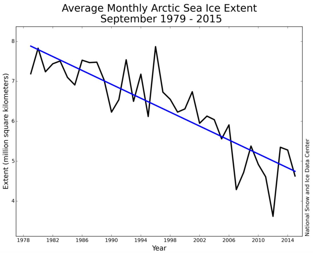
Figure 5 – Shows the recent downward trend in Arctic sea ice extent.
However, sea ice extent alone does not reveal the whole picture because even the thinnest ice will be recorded in this metric. What is more revealing is the measurement of the volume of the sea ice. This is much harder to do and there are two main satellite measurement techniques that are used. Firstly, there is altimetry where satellites measure the height of the ice. Incredibly they can detect changes of just a few millimetres from an altitude of around 1000km! Secondly, exquisitely sensitive changes in the gravitational field of the Earth are measured using satellites, notably NASA’s GRACE satellites. This reveals the change in volume of the ice as mass is lost to the oceans. The chart below shows data from GRACE for the case of Greenland and the downward trend in volume is clearly seen.
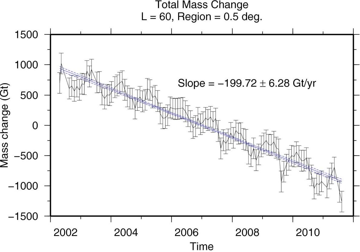
Figure 6 – The solid blue line is the best-fitting linear trend. T Harig C, Simons FJ. Mapping Greenland’s mass loss in space and time. Proceedings of the National Academy of Sciences of the United States of America. 2012;109(49):19934-19937. doi:10.1073/pnas.1206785109.
The bottom line is that the arctic sea ice volume is reducing and at an increasingly fast rate. This is true even during the years where the sea ice extent grows.
The Antarctic
Climate change deniers like to talk about the Antarctic because the extent of the sea ice surrounding the continent has actually increased in recent years! Surely that can only happen if the Antarctic is cooling, not warming!
As always, the truth is slightly more complicated and, in fact, the increase in the sea ice extent is explained by warming, not cooling! Firstly, the chart below shows that the surface air temperatures over the ice-covered areas of the Antarctic are warming. Also, oceanographic studies reveal that the surface waters of the southern oceans are warming – and at a faster rate that the global average.
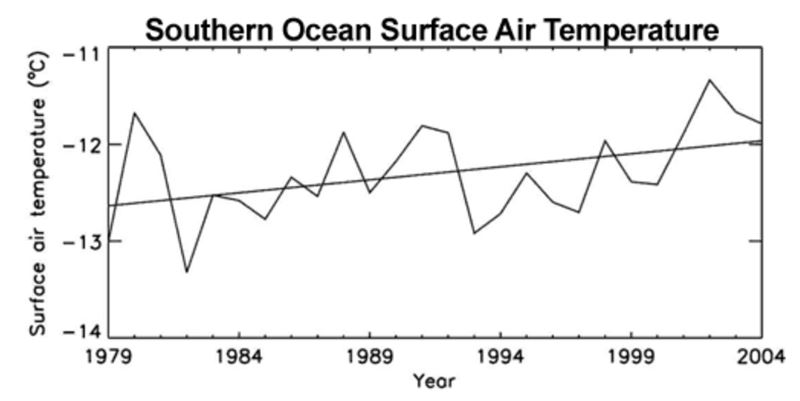
Figure 7 – Annual mean surface air temperature averaged over the ice-covered areas of the Southern Ocean. Straight line is trend line (Zhang 2007).
So, how can the increase in Antarctic sea ice extent be explained? I can’t beat this very concise explanation by John Cook from the brilliant website skepticalscience.com
There are several contributing factors. One is the drop in ozone levels over Antarctica. The hole in the ozone layer above the South Pole has caused cooling in the stratosphere (Gillet 2003). A side-effect is a strengthening of the cyclonic winds that circle the Antarctic continent (Thompson 2002). The wind pushes sea ice around, creating areas of open water known as polynyas. More polynyas leads to increased sea ice production (Turner 2009).
Another contributor is changes in ocean circulation. The Southern Ocean consists of a layer of cold water near the surface and a layer of warmer water below. Water from the warmer layer rises up to the surface, melting sea ice. However, as air temperatures warm, the amount of rain and snowfall also increases. This freshens the surface waters, leading to a surface layer less dense than the saltier, warmer water below. The layers become more stratified and mix less. Less heat is transported upwards from the deeper, warmer layer. Hence less sea ice is melted (Zhang 2007).
Antarctic sea ice is complex and counter-intuitive. Despite warming waters, complicated factors unique to the Antarctic region have combined to increase sea ice production. The simplistic interpretation that it’s caused by cooling is false.
There are other indicators that point to the fact that the world has warmed over and above what is expected due to natural variations in recent years. I think I have laid out enough evidence in this article to close the case. However, as an exercise for the reader you might like to look into these topics:
- Spring arriving earlier
- Increase in ocean heat content
- Rise in specific humidity
There are others…